UX Designer & Researcher
8 weeks
Figma, Tablet, Pen & Paper
Many people new to personal finance felt overwhelmed and stuck between not knowing where to start and trying to make confident financial decisions. I led the UX design of Fin, a cross-platform experience designed to gently guide users through the early stages of financial education and planning. This case study explores how a foundation of curiosity and empathy helped reveal the deeper needs beneath the frustration—ultimately leading to a solution that values clarity, trust, and meaningful learning over complexity.
Users struggle to balance time between their obligations, learning, and personal life. To support them, the mobile app and website have to be fast, intuitive, and flexible that makes financial planning feel simple, stress-free, and worthwhile.
Goals: 1. Respect Users' Time 2. Make Learning Personal 3. Simplify 4. Empower
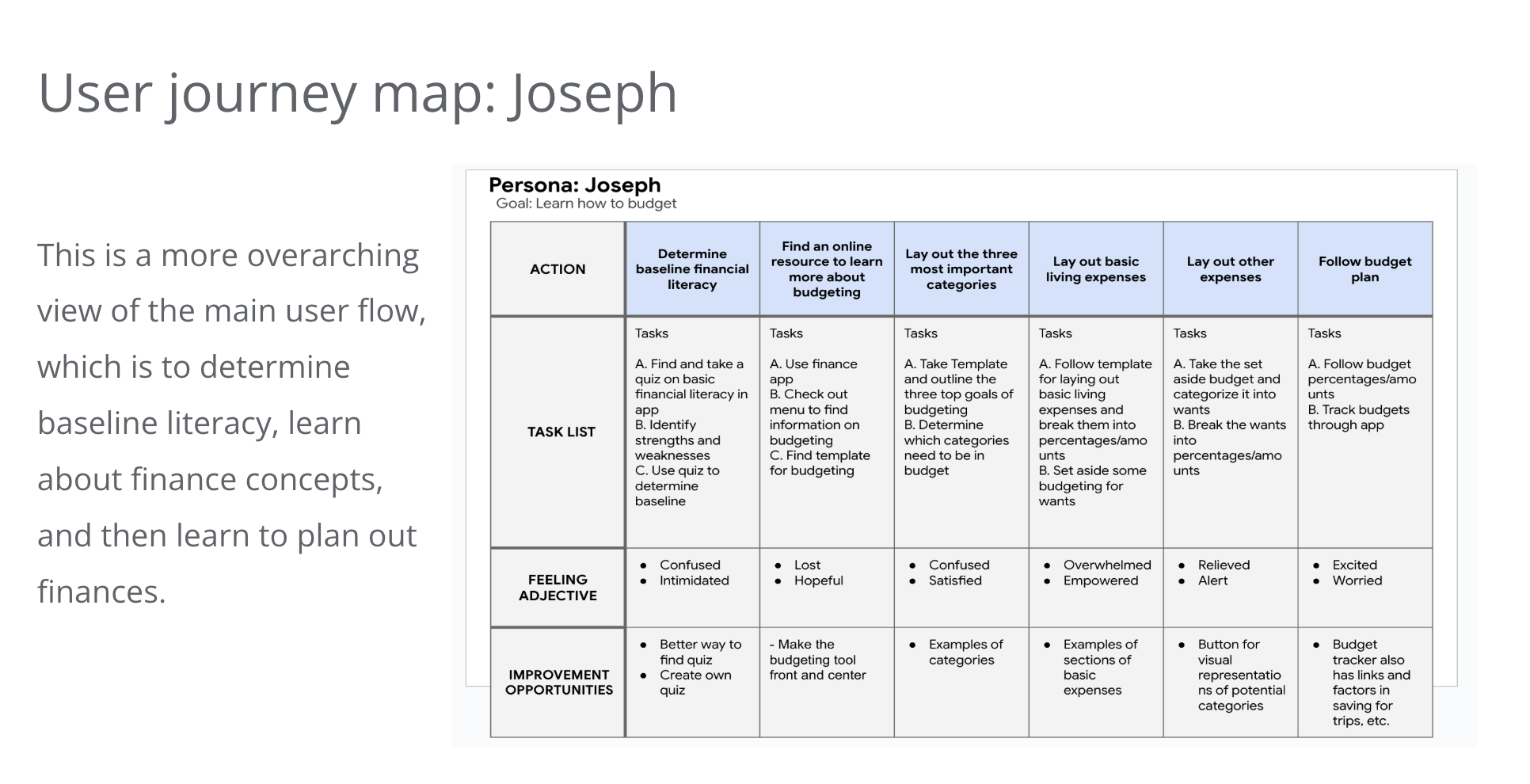
User research was conducted with participants aged 20 to 50, capturing not only their words but also their body language and tone to uncover genuine feelings and priorities. Through empathy maps and personas, I identified that personal finance was not always a top concern; instead, users viewed money primarily as a tool to live their lives the way they want.This insight guided the creation of user journey maps, illustrating how different personas engage with financial education tools and their emotional journey along the way.
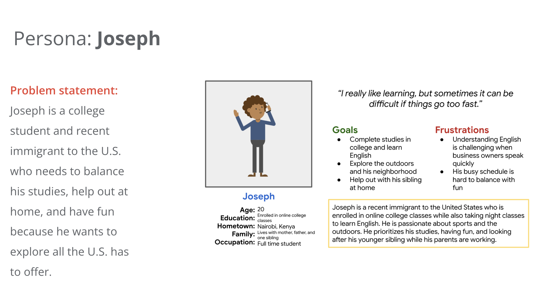
Key Insight: Users prioritize life experiences, using money as a tool to do the things in life they love to do.
Many individuals, whether students, professionals, or caregivers, struggle to balance their responsibilities, personal well-being, and future aspirations. They need tools or support systems that help them manage their time, finances, and goals efficiently, so they can live fulfilling lives while maintaining the relationships and careers that matter most to them.
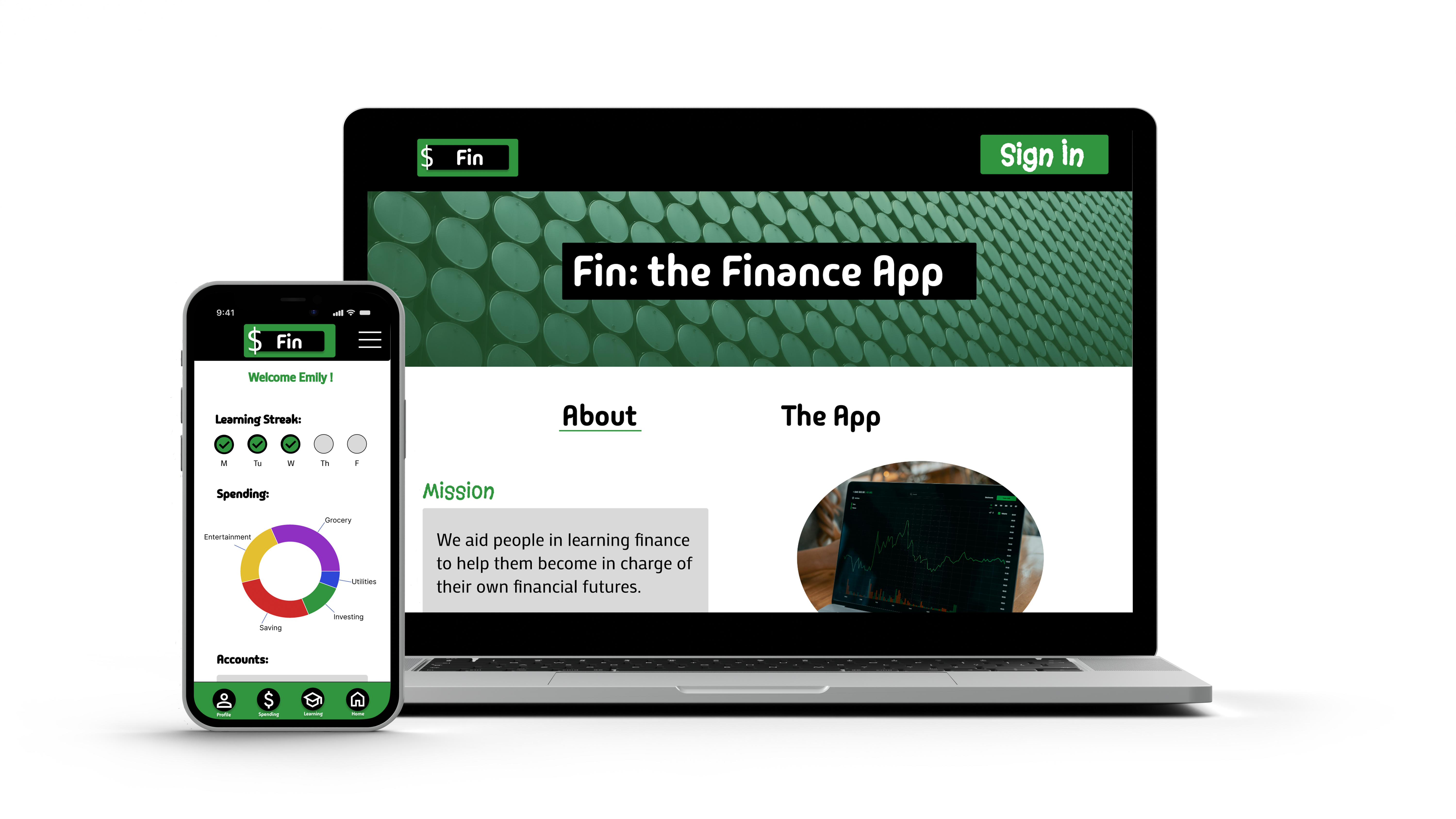
For Fin, I prioritized a consistent and accessible user experience across both mobile and web platforms:
Why Mobile First? I began with mobile design, anticipating that solving for smaller screens would streamline the transition to a more complex desktop layout. When designing the website interface, the goal was to keep it simple and consistent with the mobile version while staying true to Fin's branding.
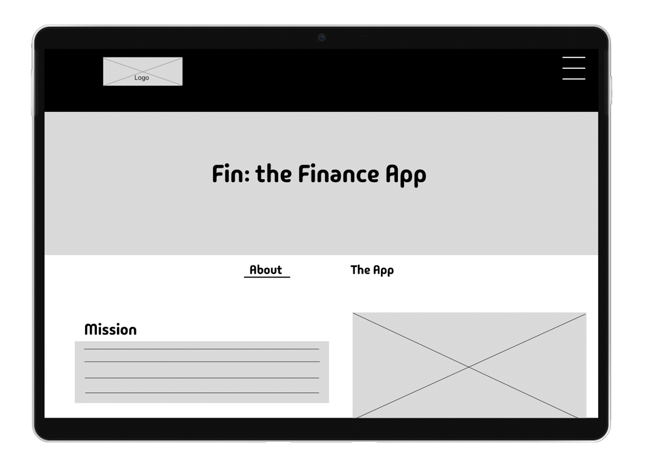
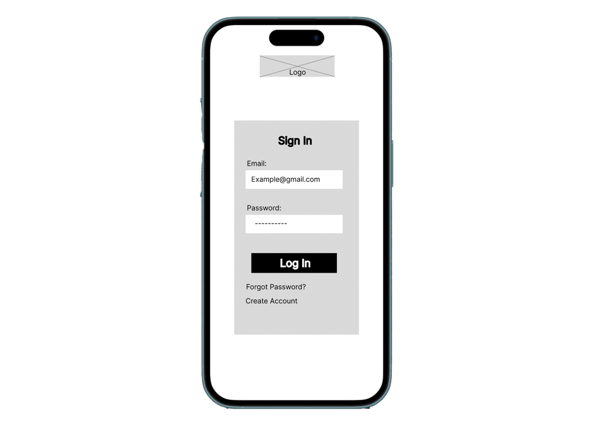
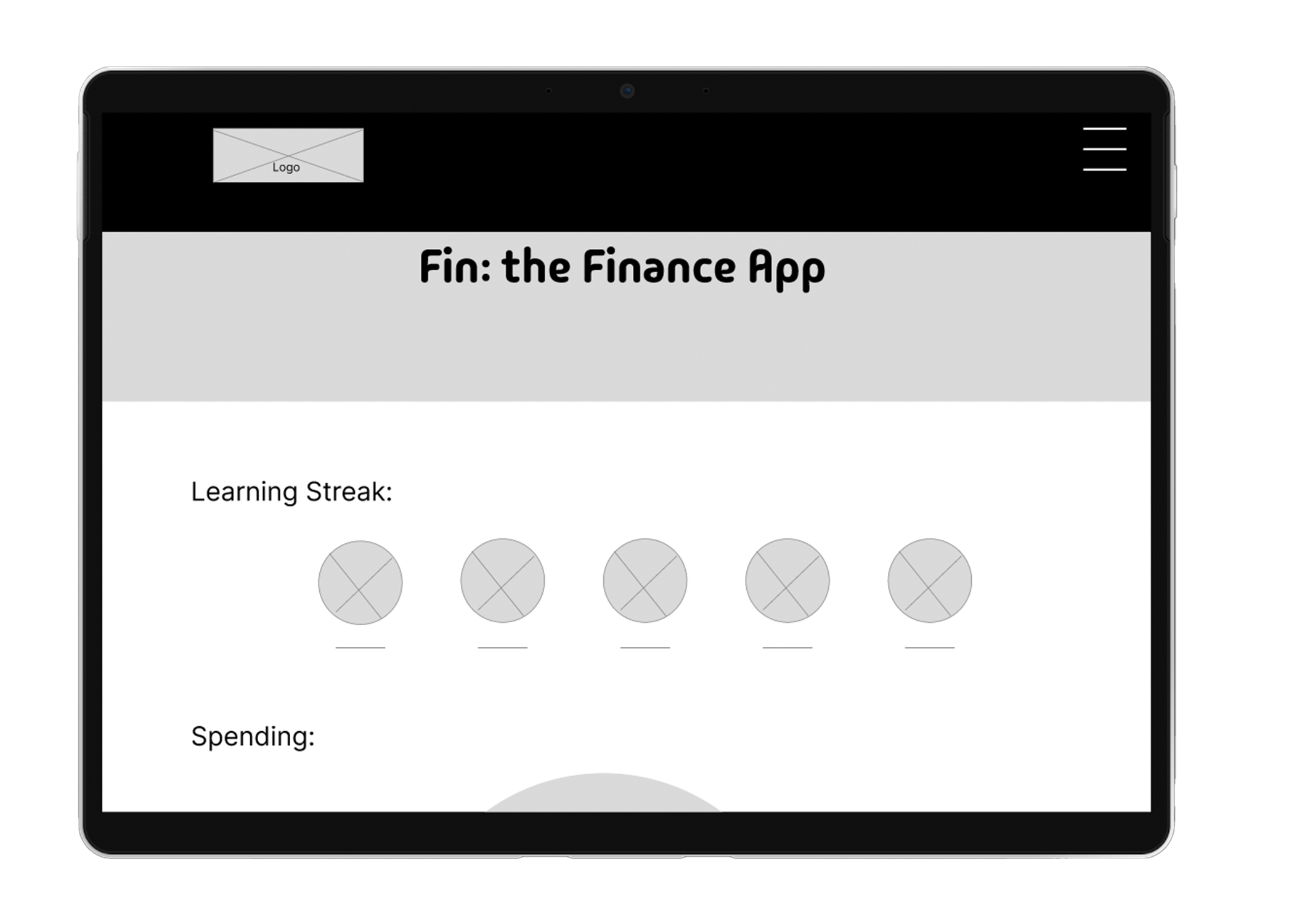
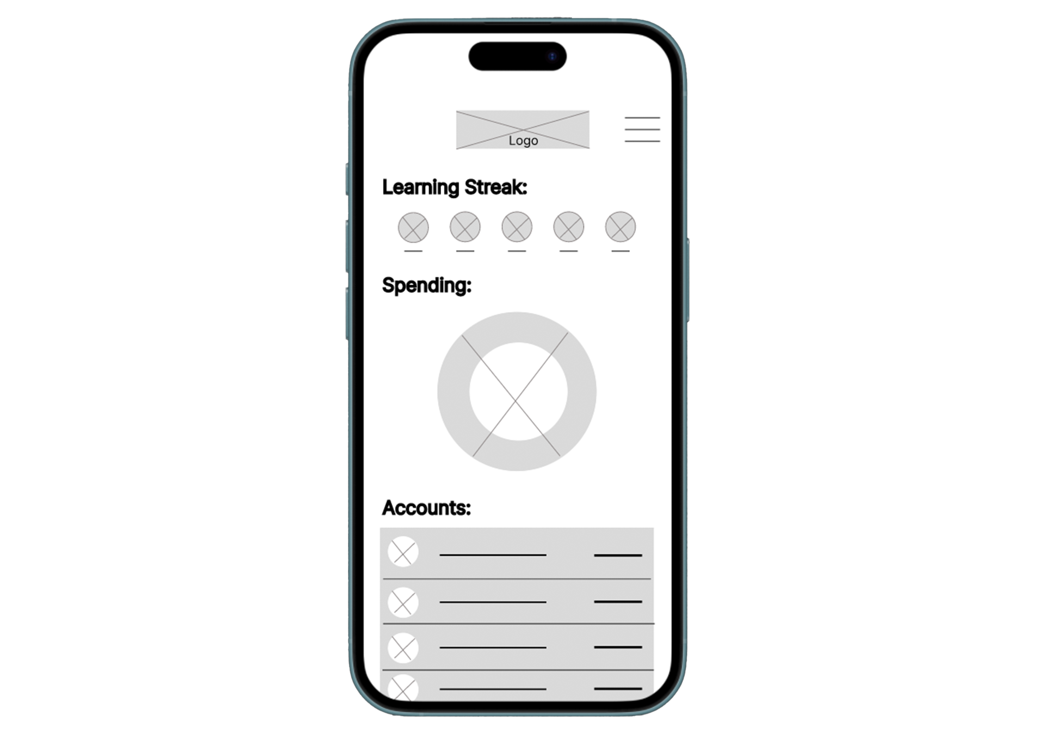
Check out the low-fidelity prototypes here:
Mobile Website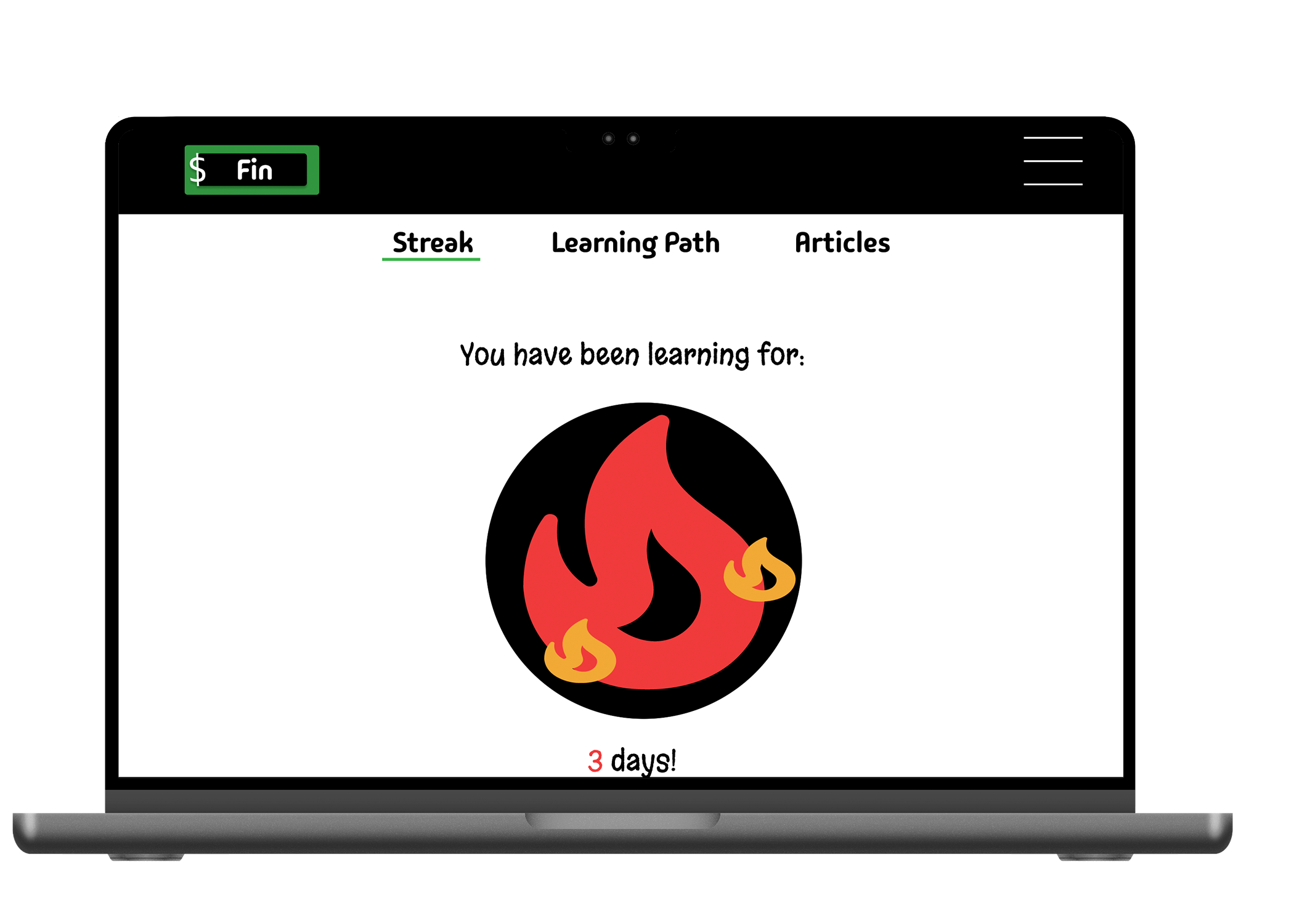
These prototypes were refined through multiple usability testing sessions, focusing on improving accessibility and smoothing out user pain points. Feedback was quickly implemented to enhance the experience.
I ran unmoderated usability studies with 5 people each time to gain user feedback and insight into the designs to iterate through the design process to improve upon the current designs.
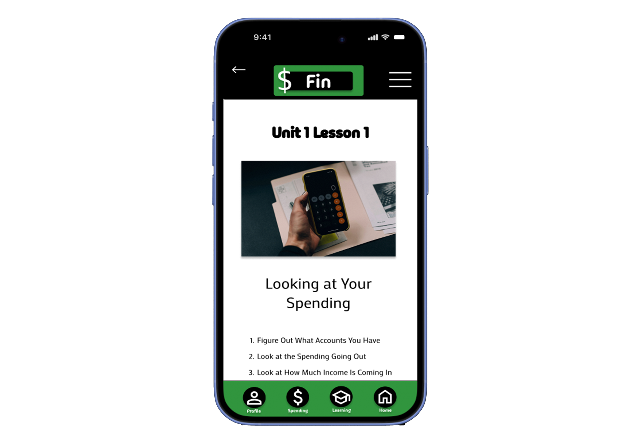
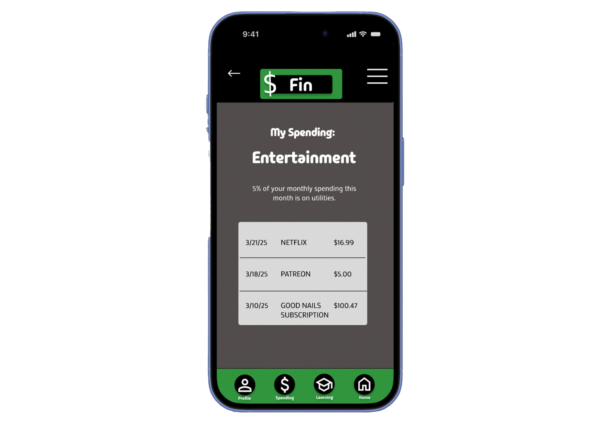
Mobile App Design:
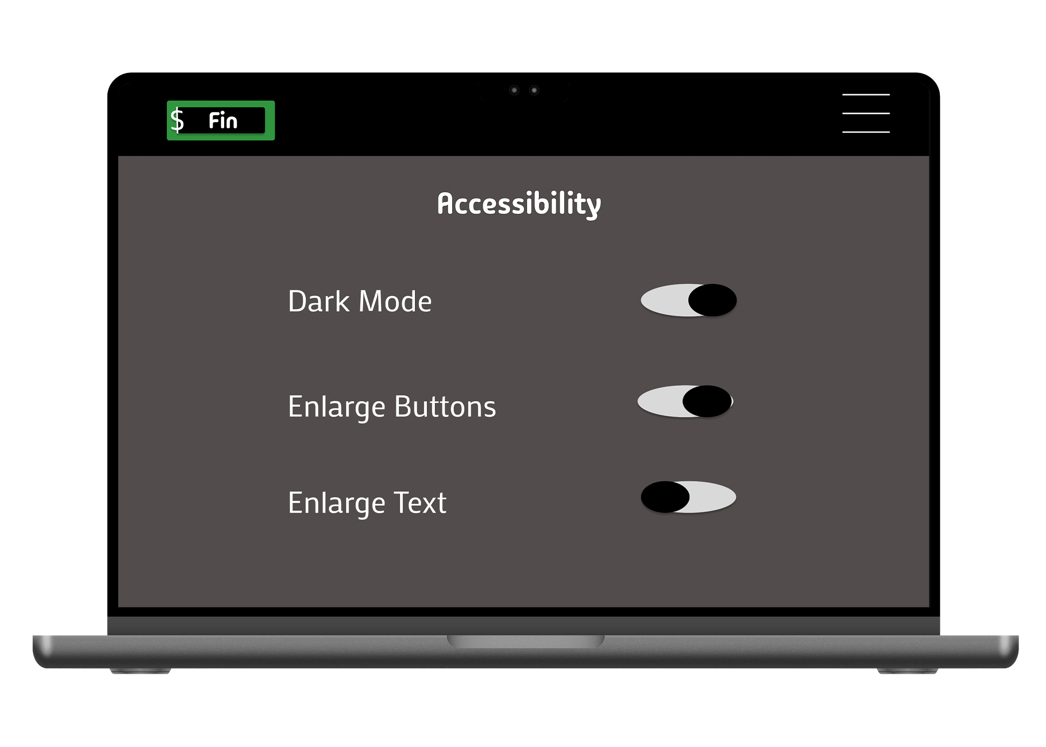
Website Design:
This project reminded me that UX is as much about learning as it is about usability. Leading with curiosity and empathy allowed me to design solutions that did more than complete tasks—they encouraged genuine engagement and personal growth.
Looking back, I would have prioritized involving neurodiverse users earlier in the design process. Their insights during testing revealed important accessibility considerations that would have enriched the design had they been included from the start.